

How to Make REALISTIC Lighting in Your Art!
I thought I’d make a mini tutorial on rendering realistic lighting scenarios digitally. This tutorial is compatible with most drawing softwares, as long as they have blending mode options.

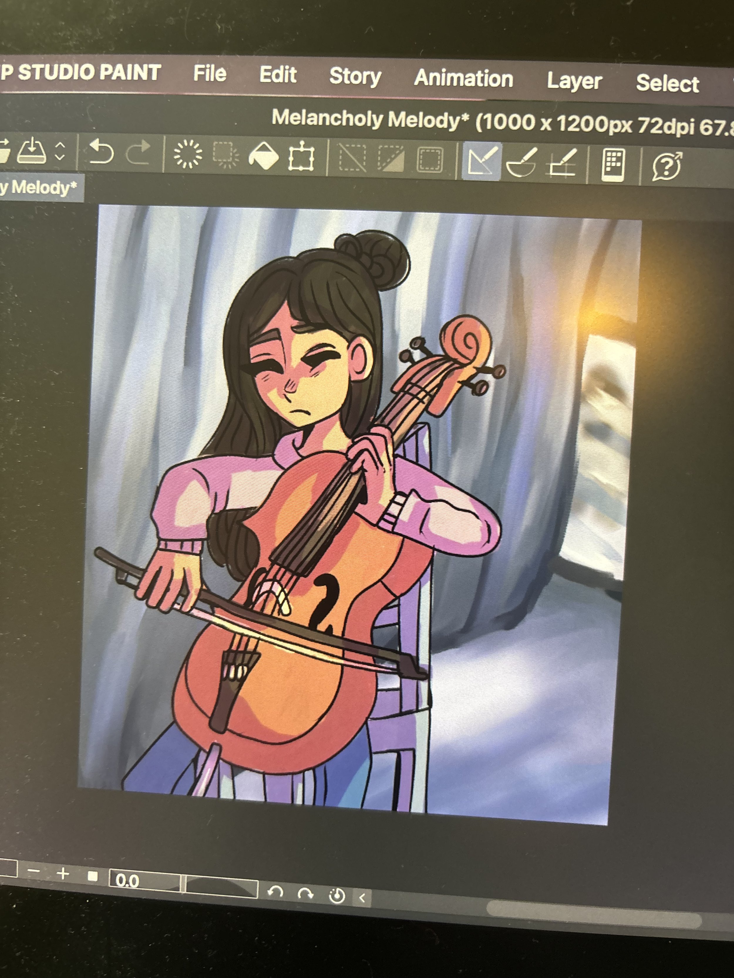
The illustration we will be using for this lesson is Melancholy Melody, an illustration of a girl playing the cello behind the curtains of a stage.
Step One: Define your light source

Here we have the flat colors for the girl. At this point, you need to define where your light source will be coming from and how bright it will be.
I chose to have my light source at the top right of the room, and I expect some of it to bounce off from the mirror and hit the bottom right parts of her more softly than the direct light that will hit her closer to the top.

A quick doodle I made to help explain to you how shadows work.
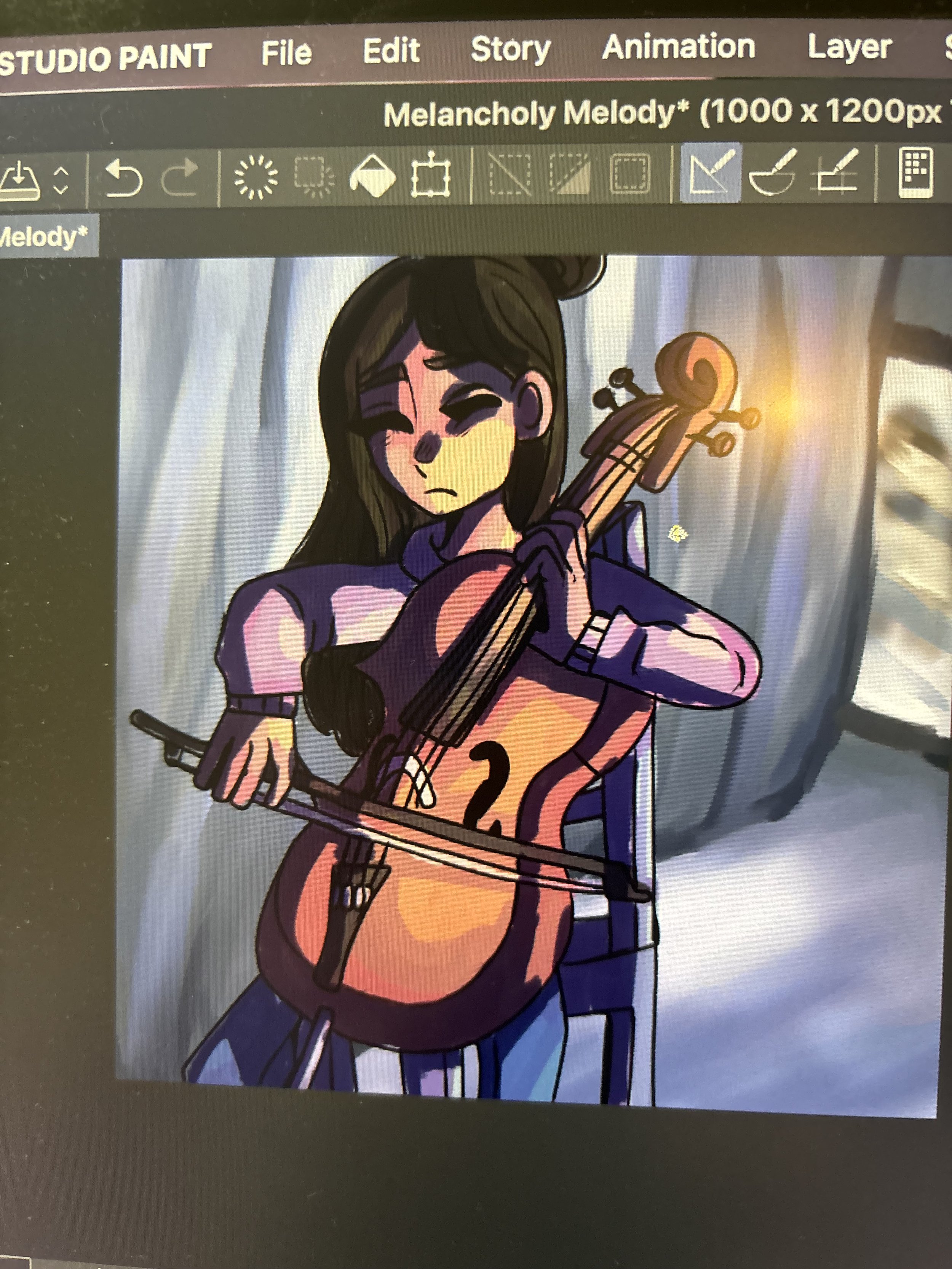
After you’ve determined your light source, create a new layer and clip it to the flat colors. Then change the layer blending mode to multiply and fill in the areas furthest away from the light. If you do not know how to change blending modes, you can look up tutorials online for your specific software.
As you can see, since my light source is to the right I used a pinkish color to shade in the areas that are on the left. I keep in mind that the shadow from the cello might cause her entire right leg to be in shadow. After I did this I also lowered the opacity of the shadow layer slightly.
Step Two: Further define your shadows
It doesn’t matter if it’s on the same layer as the one we just made or on a different one, as long as it’s still multiply, but you now need to go in with a slightly lighter color than the one you just used and shade in the areas that are slightly closer to the light source with that one. Then use a much darker color in the hue that you feel would fit the scene best and paint along the edges that are further away from the light. (See the image below)
After using the darker color

Then after blending it out more with the lighter color; turn down the opacity of the layer by 10-20% to make it slightly more subtle.
For highlights, make a layer over that one set to overlay mode and use a color barely darker than white to go over the edges of the side that the light source is on. Lower the opacity of that layer as well.
Step Three: Continue to push the lights and darks of the piece
The last step of this tutorial is to create a new layer on top of the layer you just created, clip it, and then use an even darker color. Set the blending mode to overlay and completely cover every area of the character except for where you put the highlights. Then lower the opacity of the layer by 35-50 %.

Once you’ve done that, make a layer on top of all the other layers in the illustration and use an airbrush set very dark to again go over all the areas furthest from the light source. This will push the depth of the artwork and make it look more finished. Feel free to also do this with the highlights set to add or add (glow) if the environment in your art is brighter.
Holiday Updates
- After Sunday, December 24th, I will be taking a break on blog posts until 2024. However, I will continue to upload all artworks that I make on my gallery.
- With the start of 2024 I will also launch a YouTube channel! Be sure to keep updated on my art so that you won’t miss its release date.
- I’m officially reopening original character submissions! To enter, you can either send an email to drawingwithchong@gmail.com or you can go to my contact page and find the link to my OC submissions form. (No email required)
I look forward to continuing my artistic journey with you! Thank you for all the support!